The Data Visualization Train
Published on August 6, 2020, at 10 a.m.
by Victoria Morris, Guest Contributor.
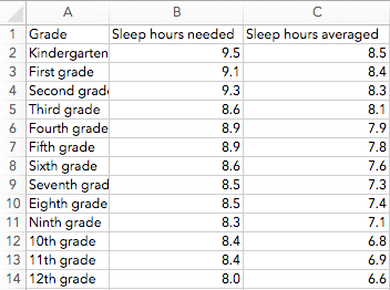
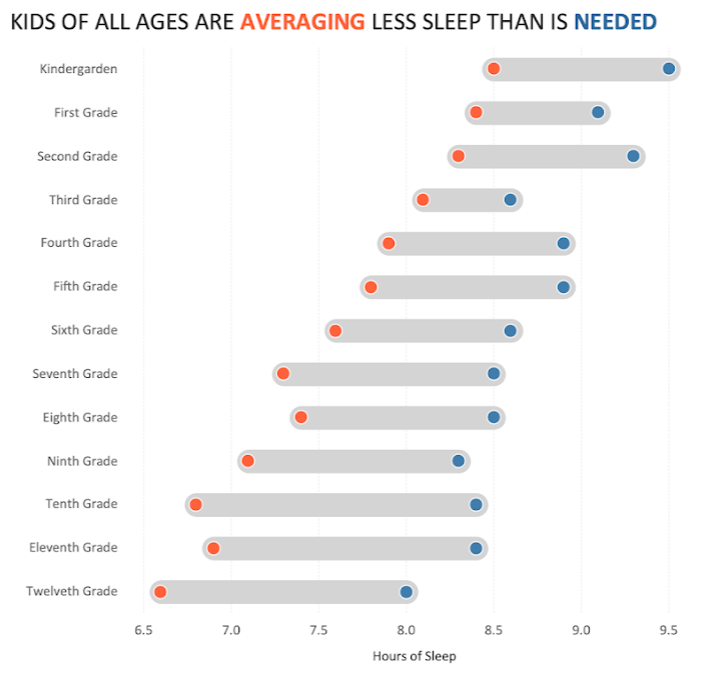
Look at both images below. Which is easier to understand? What story do you see in the Excel sheet versus the Tableau dashboard?
When you flip through a book, do you look at the fine print or the featured images to analyze the story? The images highlight the main aspect of the story and help you make quicker decisions — like whether you do or do not want to read the book. The fine print is a deeper dive with a more detailed explanation of the picture.
The fine print is our data. Just like how fine print is the background of the image, data is the foundation of visualization. In other words, data helps you form the story, while the visual helps you tell the story.
Data visualization relevance
During a 2009 interview, Google’s Chief Economist Dr. Hal R.Varian stated, “The ability to take data — to be able to understand it, to process it, to extract value from it, to visualize it, to communicate it — that’s going to be a hugely important skill in the next decades.” Data visualization is an art that visually communicates and generates understanding with viewers. For you to understand data is one thing; to make other people understand it, generate emotion and make a connection with data are another.
In this Information Age (also known as the Computer Age, Digital Age or New Media Age), it is easier than ever to jump on the data visualization train. Tableau is an interactive data visualization software – just drag and drop your data, then start creating visuals. This business intelligence tool automatically populates charts and graphs for your data, which makes a technical background needed little to none.
“Data Visualization” course creator Dr. Chapman Greer at The University of Alabama, said Tableau is the best data visualization platform and “there’s not a close second.” However, she still encourages users to play around with it and continue to challenge yourself.
Dr. Greer developed her passion for data visualization when working on an approximately 450-student cheating scandal. She said Tableau helped her reduce the cognitive load to communicate her findings visually, “making life simpler and more efficient.”
Ryan Murphy, former teaching assistant of Dr. Greer and current metric & data analyst at Lockheed Martin, uses Tableau daily to complete his work: whether it’s by answering questions for himself, building out a visualization for someone or crafting a tool for a team to explore their data. Murphy refers to data visualization as “the most appealing way to describe the world.” Dr. Greer and Murphy are two of 300,000 people who utilize Tableau to analyze and share data, according to Tableau.com.
Data visualization in public relations
Data visualizations through Tableau can be utilized by the public relations industry. Public relations professionals are storytellers, brand developers and effective communicators. The Public Relations Society of America defines public relations as “a strategic communication process that builds mutually beneficial relationships between organizations and their publics.” Murphy said if the public is anything like him, they’ll rely on illustrations and visuals more than anything else. Tableau is an opportunity for public relations to build quick connections and understandings with their audience.
Public relations professionals can implement data visualizations usage through blogs, social media accounts, pitches and client-data evaluations. Tableau visuals can be shared through emails, published to Tableau Public, transferred into a PowerPoint presentation and more. Additionally, public relations students can better communicate skills and experience with data visualizations on a visual résumé. Keep in mind, the visuals should always represent the brand — individual or company.
Public relations agencies serve a variety of industries and brand personalities. To represent a client efficiently is to understand its data, the qualitative or quantitative variables collected together for analysis. Public relations professionals can use Tableau for internal communication, client management and external awareness.
“I’m sure that most people would feel some level of discomfort if they were forced to drive a car with no speedometer,” Murphy said to compare operating a business without looking at its data. He concluded that any company, and even any individual, would benefit from understanding relevant data.
Helpful tools for data visualization:
• Book: “Storytelling with Data” by Cole Nussbaumer Knaflic
• Free tutorials: Tableau
• Blog: ryanmurphy.com