Pantone Color of the Year? Groundbreaking.
Published on October 1, 2019, at 6:30 p.m.
by Ally Denton.
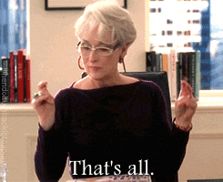
“Oh, I see. You think this has nothing to do with you. … But what you don’t know is that that sweater is not just blue, it’s not turquoise, it’s not lapis, it’s actually cerulean. You’re also blindly unaware of the fact that in 2002, Oscar de la Renta did a collection of cerulean gowns. … Then it filtered down through the department stores and then trickled on down into some tragic ‘casual corner’ where you, no doubt, fished it out of some clearance bin. … [S]o it’s sort of comical how you think that you’ve made a choice that exempts you from the fashion industry when, in fact, you’re wearing a sweater that was selected for you by the people in this room.”
The quintessential blue sweater scene from the 2006 movie “The Devil Wears Prada” created buzz about trend predictions and the trickle-down theory in fashion. Many viewers wondered if their choices were predetermined by fashion head honchos like the iconic character Miranda Priestly. Although “The Devil Wears Prada” screenwriter said the scene was mostly fabricated, the monologue parallels how influential color trends are in multiple industries (Grazia).
Back in 2016, “millennial pink” dominated fashion, beauty and branding — a direct correlation to the influence of Pantone’s Color of the Year Rose Quartz. This whimsical shade of pink infiltrated every industry. It dominated in beauty with Glossier’s minimalistic packaging and appeared on multiple album covers, notably The 1975, Mac Miller and Flume. According to Pantone, the Rose Quartz color paired with Serenity Blue “demonstrates an inherent balance between a warmer embracing rose tone and the cooler tranquil blue, reflecting connection and wellness as well as a soothing sense of order and peace.”
Every year the Pantone Color Institute examines color influences all over the world, looking at pop culture, art, fashion and much more. Pantone’s color choice influences products and consumers’ purchasing decisions across various industries. It pays attention to colors that appear in brand campaigns as a sign of a shade’s prominence. For example, Pantone pointed to Apple’s release of a coral iPhone XR in late 2018 and Airbnb’s coral-heavy “Belong Anywhere” campaign.
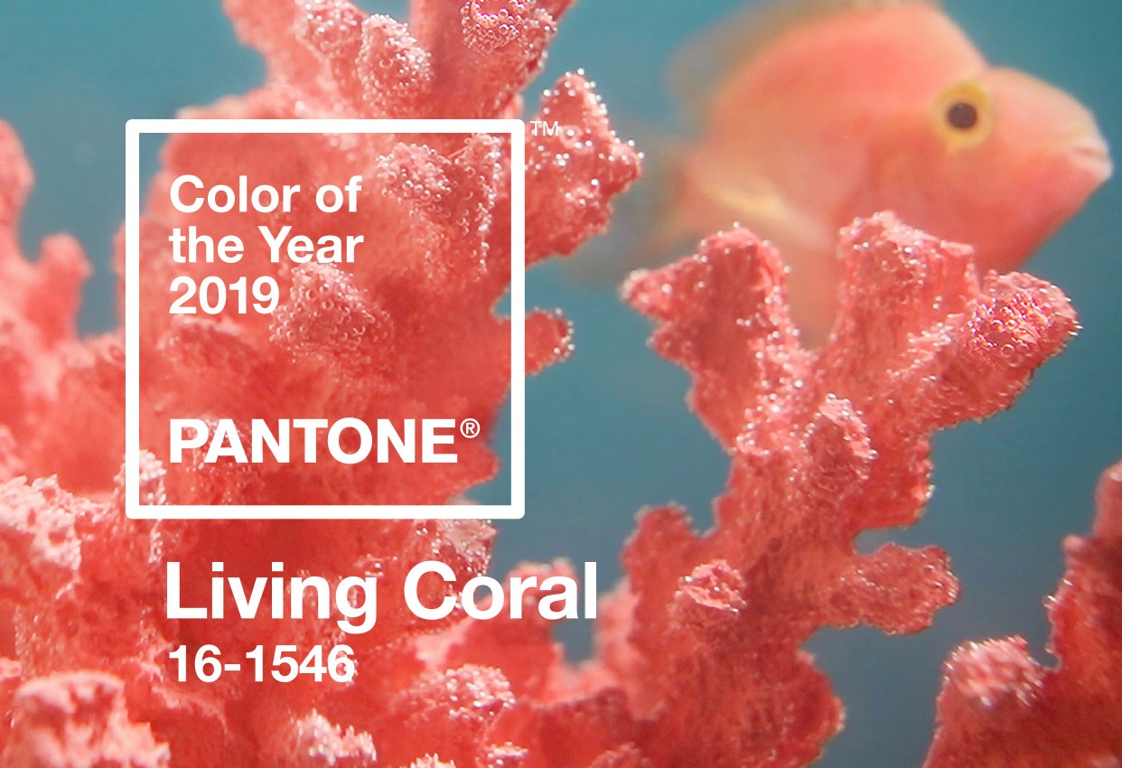
The 2019 Color of the Year is Living Coral, a vibrant and energizing hue. Resembling thriving underwater reefs and sunset-splashed skies, this year’s shade is inviting and warm. The executive director at the Pantone Color Institute said, “The humanizing and heartening qualities displayed by the convivial PANTONE Living Coral hit a responsive chord.” Consumers are looking for genuine and captivating experiences that emphasize connection. This desire for intimacy is a response to the oversaturation of digital technology and social media (Pantone).
In addition, this color plays into the importance of environmental awareness in today’s society. Laurie Pressman, the vice president of the Pantone Color Institute, said, “Just as coral reefs are a source of sustenance and shelter, we see this color giving us assurance and buoyancy in an environment that’s been continuously shifting for 10 years.”
Living Coral has permeated various industries so far in 2019, noticeably popping up at this year’s New York Fashion Week. Marc Jacobs debuted multiple coral-hued items, such as a stunning feather coat and playful ruffled dress. Multiple celebrities have sported Marc Jacobs’ Living Coral items — like Kacey Musgraves in a coral-hued feather set on the Glamour cover and Vanessa Hudgens at the premiere of her movie “Second Act.”
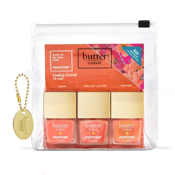
Pantone partnered with numerous brands to create coral-central lines. Butter LONDON released a makeup line starring coral lip shades and nail polishes. BrownTrout Publishers similarly collaborated with Pantone creating colorful planners and journals. Living Coral dominated interior design collections as well as graphic design trends.
So maybe Miranda Priestly’s infamous speech was made up — but she spoke a major truth about the influence of trend predictions. Next time you’re out shopping, look around at the colors popping up in campaigns and in new season collections.
But remember — it’s not just peach, it’s not sunset orange, it’s not light pink … it’s actually Living Coral. And no, they aren’t the same.