Bridging the Gap Between the Logo and the Message
 Who knew three little letters could cause such a stir?
Gap, the clothing store known for its iconic white-on-navy logo, launched a new look on Oct. 4. The revamped logo featured thick, rounded Helvetica font with a small blue-gradient square. Less than one week later, however, the retailer announced its decision to return to the classic logo after strong customer backlash.
Gap wanted to recreate its logo to represent and target a more modern clientele. While this thought process was sensible, the execution seemed to lack clear planning. In a time when user-generated content is the norm, it appears Gap simply did not take the time to listen to its audience prior to the launch. Soon after the new logo launched on the chain’s website , Facebook and Twitter ignited with criticism.
Gap North America President Marka Hansen said in a statement that the San Francisco-based company now realizes there may be a time to evolve the logo, but if and when that time comes, it will handle the transition in a different way.
“At Gap brand, our customers have always come first,” Hansen said. “We’ve been listening to and watching all of the comments this past week. We heard them say over and over again they are passionate about our blue box logo, and they want it back.”
Rebranding can be an inevitable and necessary process for companies to stay relevant in the minds of consumers. In such cases, companies want a change from the past and a new direction for the future. Gap, however, seemed to forget the target public. The switch from sleek and classy to modern was too much too soon.
A positive did come out of this whirlwind learning experience — it got people talking. I didn’t know so many people felt a bond with the brand; it was almost as if some were mourning the end of an era. When Gap decided to revert back to the old blue box on Oct. 11, it announced on Facebook, “We’ve heard loud and clear that you don’t like the new logo. We’ve learned a lot from the feedback. We only want what’s best for the brand and our customers. So instead of crowd sourcing, we’re bringing back the Blue Box tonight.” More than 2,100 people “liked” the status.
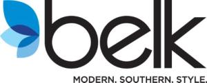
The Belk department store chain is another recent example of attempts to form an updated image. With stores in Alabama, North Carolina and Georgia, Belk is the nation’s largest privately owned mainline department store company. While the chain strives to increase offerings of upscale designers, the recent logo change seems to reflect a different kind of image. Instead of its classic logo of thin, cursive script, the new logo features a more modern lowercase font with a flower-like symbol.
The company is also sporting the new tagline “Modern. Southern. Style.” The new logo and tagline represent the first significant change in the company’s brand identity since its former logo and identity program were adopted in 1967.
Tim Belk, chairman and CEO of Belk, Inc. shared his vision in a company news release.
“Our new brand clearly communicates what our company is today and what we aspire to be in the future,” Belk said. “We want to reflect our increased focus on meeting the fashion needs of our modern customers. While we will continue to meet the needs of our traditional and classic customers, we are changing our brand and expanding our assortments to attract new customers who are looking for modern, updated brands and styles. Our vision is for the ’modern, Southern woman to count on Belk first — for her, for her family, for life.”
While it’s important to keep up with the times, companies should remember the target audience and the overall objective when rebranding. Both Gap and Belk wanted to revamp their images to a more modern style, but in doing so they lost the sense of classiness associated with the brands. Gap quickly saw the error of its ways, and perhaps Belk can successfully use its new (less than fantastic) logo to break into the younger market it wants to reach while still maintaining the quality and style expected from the brand.
Do you think it was right for Gap to change back to its classic logo?
Will Belk see the results it hopes to achieve?


