#TakeFlight: New York Jets Rebrand
Published on April 23, 2019, at 9:25 p.m.
by Hudson Nuckolls.

On April 4, the NFL’s New York Jets rebranded. Those watching football in the fall will notice pretty drastic changes to one of the most storied brands in the largest market in the NFL. This rebrand comes at a time when the team is transitioning into “the next generation of Jets football,” according to its website.
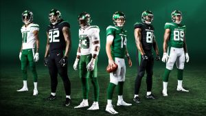
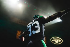
The organization, founded in 1960, unveiled new uniforms and an updated logo, all blanketed in a new color — “Gotham Green.” This is the first time in 20 years that the Jets have changed the team’s uniforms. A few of the young foundational players who make up this “next generation,” like safety Jamal Adams and quarterback Sam Darnold, modeled the new jerseys in photoshoots and at the unveiling.
While the Jets are the eighth most valuable team in the NFL according to Forbes, the lack of recent success has taken a toll on their fans. In the NFL Fan and Brand Report 2018, analytics and statistical models are used to “determine which city’s fans are more willing to spend or follow their teams after controlling for factors like market size and short-term changes in winning and losing.” The Jets were ranked #15 out of 32 on this list.

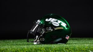
Starting at the top, the helmets, which were white from 1962 to 1978 and then again from 1998 to now, according to Bleacher Report, have adopted the new green color, complemented by black facemasks.
The home jersey, called the “Gotham Green,” has white numbers outlined in black. The script “New York” logo sits proudly above the numbers, and a large white stripe cuts from the shoulders to the middle of the jersey. The white jersey, called the “Spotlight White,” is identical to the home jerseys, except it flips the green and white colors. Each can be paired with either green or white pants that have a matching stripe down the sides.

The most intriguing jersey is the alternate “Stealth Black” uniform. This gives the rebrand a modern touch because the Jets have never had a black jersey in the team’s history. While the new green is already a powerful change, the sleek black gives the set an added “toughness and grit,” which was the inspiration of the project, according to the Jets’ website.
The primary logo is still the recognizable green oval, but slightly updated. The “NY” that used to drop behind the script “Jets” wordmark has been removed, and the full “New York” name now rests above the wordmark. The team also modernized the design of the football in the logo.
The reactions on Twitter were “mixed” according to JetsWire.com. A blurry picture from the photoshoot leaked a day before the official unveiling, and many fans impulsively reacted to it, as people tend to do on social media. A poll on NJ.com showed over 50% of respondents thought the new uniforms were “average, subpar or awful.”
Check out Adrian Covert’s article on Fast Company to see a breakdown of some successful and unsuccessful sports teams rebrands and how teams have handled the social media reaction that eminently follows.

The real measure of a rebrand, though, is about its long-term endurance. The most certain way to create positive brand experiences of new uniforms with fans is to win in them. Only time will tell if this ends up being a successful rebrand for the New York Jets.


