Graphic Design Cheat Sheet for PR Practitioners
Published on December 6, 2017, at 10:39 a.m.
by Brooke Bailey.
With contemporary communication moving more and more digital and markets becoming more and more crowded, the necessity for organizations to constantly post stunning visuals on their social media pages, email newsletters and websites is at an astronomical high.
Working in public relations means that it’s important to keep up with current trends, and to shift clients’ strategies to follow those trends. However, because of the push for visually branded content, it’s now become necessary for PR practitioners to become fluent in a whole new language: graphic design.
Communicating with graphic designers is something that PR people do every day, and knowing how to speak their language means that it is less likely that things will get lost in translation, and that the designers know what they should be creating.
If you’re nervous or you don’t know where to jump in when it comes to learning about graphic design, do not panic. I’ve created a cheat sheet that will teach you how to speak the design lingo, how to request work from a designer and even how to get started with a few design basics yourself.
Terms you should know
While the language of graphic design is not completely foreign, it can still be daunting if it’s not a practice you’re well-versed in. When you can describe a project in technical terms that designers use every day, it builds your credibility and trust with your creative. It also helps eliminate confusion and ensures that you get exactly what you pictured.
Knowing the language “definitely gets the creative in the same mindset as what you have,” says Amelia Neumeister, communications specialist for the College of Community Health Sciences at The University of Alabama. “If you can come at the creative with those words, in their language, it facilitates conversation and makes translation a lot easier.”
1. Copy: The words used in a design. Ranges from a single word, to several paragraphs, to a full-length feature story, depending on the context.
2. Web graphic: A design specifically created for viewing on a screen. Uses RGB colors (link) and dimensions are usually given in pixels (px). Some standard web graphic sizes include 1080px x 1080px for square graphics, 1500px x 500px for Twitter header graphics and 828px x 315px for Facebook cover photos. View more common sizes here.
3. Print graphic: A design specifically created for use as print materials, such as flyers, posters, magazine ads and brochures. Uses CMYK colors (link) and dimensions are usually given in inches or centimeters. Print materials almost always require the use of margins and bleeds (more on that below). Some standard print sizes include 8.5 inches x 11 inches for letter sized paper, 11 inches x 17 inches for small-poster sized paper and 5.5 inches x 8.5 inches for half-letter sized paper. See more common sizes here.
4. Pixels per inch (PPI): PPI is all about the resolution of a web image, though often you will still hear it referred to as DPI (see below). The number associated with PPI will say how many pixels are in an inch of a digital screen. 300ppi is standard in web design.

5. Dots per inch (DPI): DPI is all about the resolution of a printed image. The number associated with DPI will say how many dots are printed per inch of paper. The more dots, the higher the resolution, and the better the image or design. 300dpi is standard.
6. Letter spacing: Three important terms to know — tracking, kerning and leading. Tracking is the most basic and refers to the general spacing between letters; this deals with a whole word or sentence and adjusts all spacing to a standard width between each letter. Kerning is similar, but deals with the individual space between two letters; some typefaces may have small variations in their lettering, and kerning allows you to adjust those individually. Leading deals with line spacing, or the distance between individual lines of text.

7. Margins: A set amount of space from the edge of the design plane to the interior space of the design. Extremely important in print design, it’s advised to put words or other important visual information within the margin lines, because they may be in jeopardy of being trimmed off. Margin sizes depend on the request, but standard is 25px or .25in.
8. Bleed: Similar to margins, but on the outside of the design plane. Bleeds are almost always necessary in printed materials. Images, colors and other elements that need to travel off the edges of a design must be stretched beyond the bleed line. When printed, these will be cut to the edge of the paper so that there’s a nice, clean edge and no white space. Bleed sizes vary, so trust your designer to pick the right size for the design.
9. Hierarchy: This principle deals with how elements are arranged in the space and is one of the foundations of good design. A hierarchy system dictates how things are received visually by the viewer and is especially important when it concerns copy. It typically follows that the largest or most visually contrasted elements make the first impression, followed by the second largest or contrasted, and so on. This also dictates that for most English-speaking people, the design will be read from top left to bottom right.
10. Software: There are a number of different software programs that can be used to design both print and web graphics, but the most common ones that designers use are included in Adobe Creative Cloud — Illustrator, InDesign and Photoshop. Each of these has its own specializations: Illustrator is great for vector-based rendering and is used for a lot of more artistic, creative designs; InDesign is typically used for copy-heavy work like posters, flyers, brochures and magazines; Photoshop is mostly used for editing and retouching photographs.
How to request work from a graphic designer
Now that you’re well-versed in some of the graphic design lingo, requesting work from a designer should be easy. There are different methods of requesting work, but your best bet is to talk to your creative to see what they prefer.
“In general, you want to give them as much information as possible. If you do that, then they will give you back as close to what you want as possible,” said Mike Little, a professor in The University of Alabama’s Department of Advertising and Public Relations.
The best method to do that?
“Creative brief. Creative brief. Creative brief,” said Neumeister. “And if you don’t have one, just make a list of everything you need from your designer.”
A few things you should include in your creative brief:
– Platform (web or print)
– Dimensions
– Fonts
– Colors
– Photos
– Copy
– Purpose
– Audience
– Examples or inspiration
– Sketches
Jessie Ford, a graphic designer at CMA, says that it’s important to put your trust in your creative and to give that person creative freedom with the design; but she warns against not sending your designer enough information to create the graphic you’re looking for.
Creating a graphic is similar to writing a press release or creating social media content — you have to have the background first. Knowing the audience and the purpose of the piece makes creating it much easier for the designer, and will more likely get it into your hands much faster.
Why you should spend more for high-quality work
Hiring a graphic designer or paying a freelance artist can get expensive, and is often one of the first things to go when it comes to budget concerns. However, placing a higher value on good graphics can help create a more successful campaign.
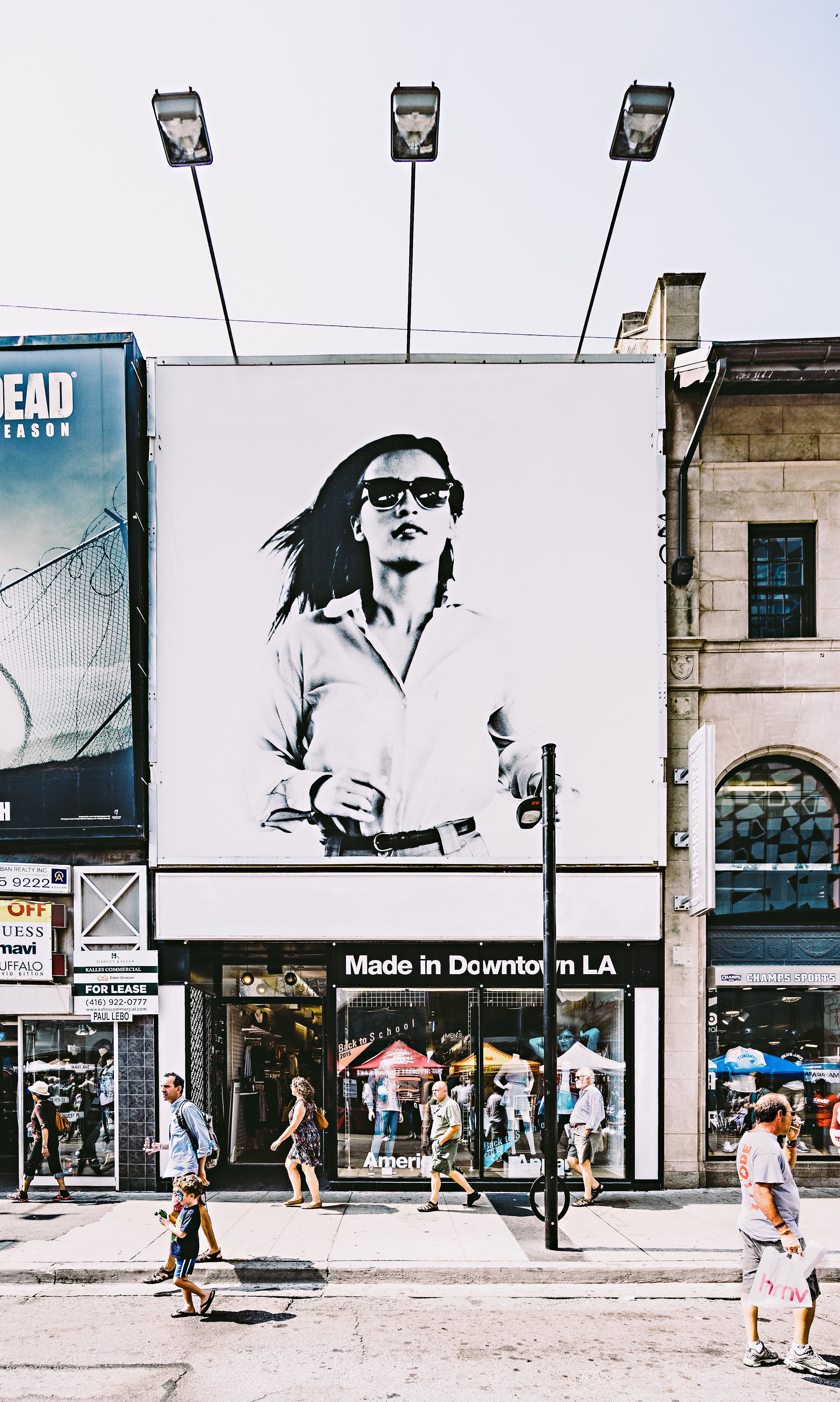
Even if you have the greatest ideas and content of all time, with nothing to catch the audience’s eye, it will never be as successful. Conversely, the visuals can’t do all the work; they must be supported by quality PR work.
“I once saw a painting truck, and on the side of the truck they talked about the quality of their work, and paint was peeling off,” said Little. “If the visual and what you say don’t jive, then your audience is on to their next choice.”
Better design also gives your organization better credibility. Consistent, clean design sends a message that you know what you’re doing, and leaves a good first impression on your public.
Neumeister says that if you are unable to present your information in a visibly appealing way, nobody is going to care. “It could be the best paragraph you have ever written in your life; no one is going to care if it is just on an 8.5-by-11-inch sheet of white paper,” she explained.
Tips for basic design that you can do yourself
Now that you know the lingo, how to request work from a designer and why good graphics are important, it’s time to try your hand at some basic design.
Knowing how to create a simple graphic and how to edit details when you don’t have time to send changes to a designer will make your life way less stressful. All it takes is the courage to jump in.
“If you’re making a change and you have all the files, go ahead and do it. If it’s a copy change, do it. Take it into your own hands and do it,” said Neumeister.
Start by opening up some software and playing around with the features. YouTube is a wonderful resource, and many of its tutorials include the files you need to follow along. Many designers also find inspiration and even resources on websites like Pinterest.

Another way to learn your way around graphic design software is to ask your creative, or a friend who knows the software. Ask them to give you some tips, and even a bit of their time to show you a few tricks. Knowing how to create basic graphics is an important and marketable skill that may even lead you down a path you weren’t expecting to take.
Neumeister says that when learning graphic design, it’s important to “take every opportunity you have to do it; you’re going to be terrible for a while but take every opportunity to practice and don’t be afraid to make mistakes.”

