The Secret to Rebranding Success: Stay Confident
Posted At: November 21, 2011 1:11 PM
by Sarah Shea
 Coca-Cola products have a longstanding signature brand. Coca-Cola’s bright red and token script give the product a timeless, easily identifiable look.
Unlike some of its competitors, Coca-Cola’s brand hasn’t had too many fundamental changes over the years. When following the evolution of the brand it’s easy to see just how small some of the changes have been.
Occasionally, the company takes the products and rebrands them — still maintaining brand integrity. Soda drinkers worldwide recognize Coca-Cola’s Christmas packaging, laden with Santa and snowflakes.
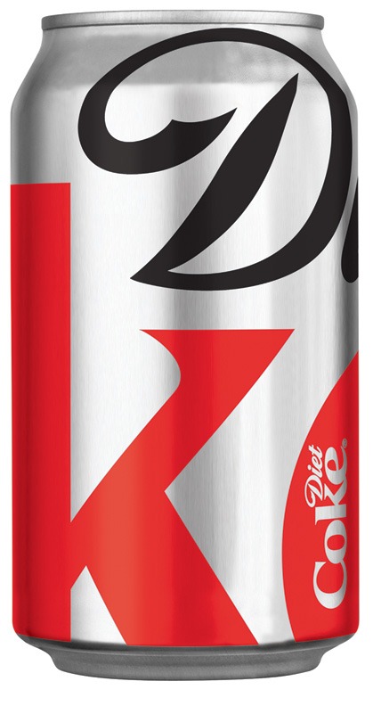
The company’s current rebrands don’t feature jolly old men, but bold statements. Diet Coke’s new 125 anniversary packaging hit store shelves in September and beginning November 1, Coke’s new packaging made its debut. Though the rebrands occur simultaneously, each has its own purpose.
Diet Coke: Exuding self-confidence
Diet Coke’s new brand features a tighter crop on the soda’s regular brand. The crop gives a dramatic, new twist on the old classic.
Kerry Tressler, senior manager, brand and business communications for The Coca-Cola Company, said, “We actually used the familiarity of the package design as an opportunity. Because consumers know and connect with the logo, Diet Coke was the perfect brand to execute this new look.”
The new look didn’t stop at the soda can. The company also aired 15-second TV spots, all landing on the tagline “Stay Extraordinary.” Even fashion guides came with the product update.
“The stylish new look is a reflection of the self-assured, confident and aspirational people who enjoy Diet Coke every day,” Tressler said.
Diet Coke’s new packaging could be said to reflect the integrity of Coca-Cola’s own brand.
Coca-Cola: Raising awareness
The purpose of Coca-Cola’s new packaging is significantly different from that of its zero-calorie counterpart.
According to an Oct. 25 press release, the “iconic Coca-Cola red can turn arctic white.” The purpose? To raise awareness for the protection of the polar bear’s home.
“Together, Coca-Cola and [the World Wildlife Fund] are raising awareness and funds for conservation efforts to create a safe haven for the polar bear,” Tressler said.
The polar bears were first introduced in Coca-Cola’s print advertising in 1922 and have since been featured in Coca-Cola’s branding.
Again, the move is bold. Making the company’s signature color an afterthought is no small feat. The hope of the company, according to Tressler, is that the color change will cause people to want to learn more about the polar bears and, in turn, donate.
“People tell us they want to help make a positive difference in the world, and that’s what Arctic Home is all about,” Tressler said. “We’re addressing a challenge and inviting our fans to help.”
Kristin Craik, editor of Business Review Canada, wrote an article on the rebrand, questioning whether the rebrand was just an attempt to make holiday rebranding backed by a good cause.
The benefit of the cans, however, does not eliminate potential confusion on behalf of the consumer.
“I see some confusion in the upcoming months because Diet Coke and Coke have just both rebranded to a more silver/white can,” Craik said. “I could easily see consumers being confused down the grocery aisle, at least at first.”
In Diet Coke’s “self-confident” new look and its Arctic Home awareness campaign, has Coca-Cola managed to “stay extraordinary” in branding efforts?